Checklist · 2025-03-11
What a good service business homepage needs in 2025
Most service business homepages make the same three mistakes: they explain before they offer, they bury the next action, and they look identical to every competitor. Here is a practical checklist for fixing that.
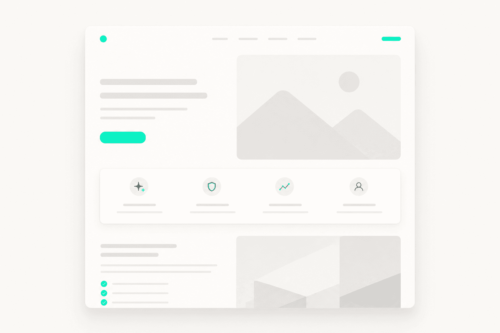
A homepage has one job: get the right visitor to take a next action. That means a clear offer above the fold, an obvious path to contact or book, and enough trust signal to make the first step feel low-risk. Most service business sites fail at all three.
The first mistake is leading with the company story instead of the client outcome. Visitors arrive with a problem. They are not here for your founding year or your mission statement. The headline should name what you do and who you do it for, with enough specificity that the wrong visitor self-selects out and the right one leans in.
The second mistake is a single generic contact form with no direction. If your best offer is a free consultation, that should be the named CTA — not a button that says 'Get in touch.' Name the action, describe what happens after the visitor clicks, and keep the form to five fields or fewer. Every additional field costs you conversions.
The third mistake is treating mobile as an afterthought. More than 60% of service business web traffic is mobile, and the majority of local searches happen on a phone. If the booking path or phone number is not reachable within one tap on a phone screen, you are losing the highest-intent visitors.
A strong homepage is not a design achievement. It is a conversion infrastructure decision. Audit yours by reading it aloud to someone who has never heard of your business. If they cannot describe your offer and next step in 30 seconds, the page is not doing its job.